
An easy trick to make your letters, e-mails, memos, ads, proposals, press releases and résumés a delight to read.
- 50% of adults cannot read a book written at an eighth-grade level. (Literacy Project Foundation)
- Currently 45 million Americans are functionally illiterate and cannot read above a fifth-grade level. (Literacy Project Foundation)
- 50% of Americans can’t read well enough to balance a checkbook or read prescription drug labels. (Embracing Dyslexia)
- “The addictive nature of Web browsing can leave you with an attention span of nine seconds—the same as a goldfish.”—Dr. Ted Selker, MIT Media Lab.

What everybody reads today: mini-messages
The Tweet—140-Charater Limit
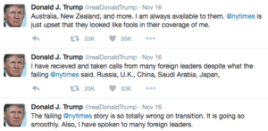
317 million Twitter users send 350,000 tweets per minute, 500 million tweets every day. (David Sayce)
The Text—160-Charater Limit
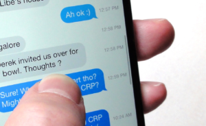
80% of Americans text each other (Pew). They send over 6 billion texts a day (Forrester).
Tweets and texts are mini-paragraphs—bite sized. Even poor readers can digest a tweet or a text.
These tiny messages are today’s written communicatons coin of the realm.
A look at the longest, most copy-heavy newspaper advertisement ever created
Below is a full-page ad that ran in The New York Times in the 1950s.
Written by Louis Engel, former editor of Business Week who became a partner at Merrill Lynch. It is entirely text. It has no photographs or drawings… nor any charts, graphs or tables.
When Engel finished writing the ad and it was layed out, there was space left over. He decided to fill that extra space with an offer at the very end of the ad.
The offer: write and receive a free booklet, “How to Invest.”
No hype. Just 73 words at the tail end mentioning the offer.
The ad ran a staggering 6,450 words—the most words ever to appear on a single page in The New York Times before or since.
Look at this behemoth and then look at the eye-popping response…
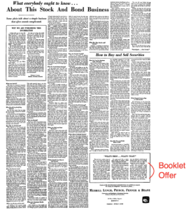
“Always make it easy to order,” Elsworth Howell of Grolier Enterprises once said to me.
- This ad broke Howell’s rule. Replying was real pain: no coupon. You want the free booklet? Here was the drill:
The results: 5,033 readers contacted Merrill Lynch by mail, phone or a visit and requested more than 20,000 copies of the booklet. WHEW!
The secret of this unbelievable success: readability
Quite simply, the ad was broken up into dozens of bite-sized paragraphs—the equivalent of today’s tweets and texts. The graphic elements in the ad:
- Upper deck (super headline):
- Main headline (big, boldface type):
- Lower Deck
that often sounds complicated”
- 3 Subheads
- 2 Boxes — Upper left and lower right
- 16 Boldface Crossheads (mini-headlines)
The key to helping readers get through long copy is to use crossheads/mini-headlines.
“After two or three inches of copy, insert your first boldface crosshead (mini-headline), and thereafter pepper mini-headlines througout.” —David Ogilvy
“An ingenious sequece of boldly displayed mini-headlines can deliver the substance of your entire message to glancers who are too lazy to wade through the text.” —David Ogilvy
Take another look at the ad above and study the mini-headlines. They are the same size and font as the text, but boldface.
These mini-headlines are usually one line—a few words. Max two lines.
In the Merril Lynch ad, Louis Engel skipped a space, inserted a mini-headline on top of the next paragraph.
Takeaways to Consider
- It is imperative to keep the reader’s eye moving.
- “Avoid gray walls of type.” —David Ogilvy
- Newspapers and magazines are dying because of gray walls of type. They are boring as dirt and hard to read.
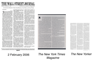
- Print publishers blame the Internet for stealing advertising and putting them out of business.
- The real problem (in my opinion): gray walls of type make them unreadable.
- “Neatness rejects involement,” said my first mentor in the business, Lew Smith.
- Every newspaper, magazine, letter, e-mail, special report, memo, blog, website or résumé should create bite-sized paragraghs with the help of mini-headlines throughout—à la the Merrill Lynch ad by Louis Engel.
- This is true of the front page and every subsequent page.
- In print, always use a serif type for readability—Times, Garamond, etc. Never use san serif type in printed text.
- Online sans serif type is best.
David Ogilvy on copy for space ads
(Consider these techniques for everything you write.)
- Keep your opening paragraph down to a maximum of eleven words. A long first paragraph frightens readers away. All your paragraphs should be as short as possible; long paragraphs are fatiguing.
- Type smaller than 9-point is difficult for most people to read.
- “Widows” increase readership, except at the bottom of a column, where they make it too easy for the reader to quit. [A widow occurs when a line of copy is too long by a single word, with the result that the word shows up in the next line—and is the only word in that line.]
- Break up the monotony of long copy by setting key paragraphs in boldface or italic.
- Insert illustrations from time-to-time.
- Help the reader into your paragraphs with arrowheads, bullets, asterisks and marginal marks.
- If you have a lot of unrelated facts to recite, don’t try to relate them with cumbersome connectives; simply number them, as I am doing here.
- Never set your copy in reverse (white type on a black background) and never set it over a gray or colored tint. The old school of art directors believed that these devices forced people to read the copy; we now know that they make reading physically impossible.
- If you use leading between paragraphs, you increase readership by an average of 12 percent.
- When text is continued on another page:
— DO SAY: “See READERSHIP page 13.”
— On page 13, use READERSHIP as the headline of the continued column.
- “Short words. Short sentences. Short paragraphs.”
- Number of words in a sentence
“As an aspiring, young direct mail copywriter in the early 1990s, I clipped an item from my local newspaper. It has been taped to my desk—right next to my computer—ever since. It is now tattered and yellow. But I keep it there as a reminder anytime I’m writing.”
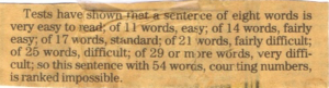
Here’s the text of the above clippling:
Tests have shown that a sentence of eight words is very easy to read; of 11 words, easy; of 14 words, fairly easy; of 17 words, standard; of 21 words, fairly difficult; of 25 words, difficult; of 29 or more words, very difficult; so this sentence with 54 words, counting numbers, is ranked impossible.
- If I have written a long sentence, I count the words. Any sentence longer than 29 words is split in two—or three.